

Breadcrumbs Hero
The Breadcrumb Hero is a customizable banner section that includes breadcrumbs and the page title. It is typically set at the top of the page. This block looks best on the One Column page template to take advantage of the template’s fullwidth. It has three different views/types with customizable background options.
Normal (Default Option)
The normal option sets the section at a medium height, the text is a lighter color for contrast against a background. This example also has a bottom gradient applied.
Large
The large option sets the section at a larger height, the text is a lighter color for contrast against a background. This example also has a bottom gradient applied.
Minimal
The minimal option sets the section at a medium height, the text is a darker color for contrast, and by default, no background is set. Typically, the page template’s page title and breadcrumbs can be used instead of this option.
Breadcrumb Hero settings:
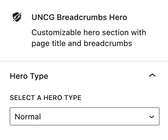
Select a Hero Type
Hero Types
- Using the dropdown, select a hero type. Normal is the default and has a placeholder image set as the background.
Setting a Background

Select a background image
- Click on the Select new image button to add an image via the media library. It is recommended to use a 16:9 image ratio and select an image that is large enough to span the width of the page.
- Once an image is set, choose a focal point for the image. This will keep the selected image portion viewable in different viewports including mobile.
- Optional, select a gradient to add some image contrast. In most cases, the bottom gradient is recommended.
- For most cases, a background image looks best but other background options are available such as setting a pattern, video, or color. For those options, you can use the wrapper block as a reference covered here.