

Hover Block
The Image Hover is a configurable 2-8 grid of images that displays more information on hover.
Main Image Hover Settings:

- Add a Hover Block Item
- To add a new item to the Hover Block please only use the “Add a Hover Block Item” button located at the bottom right of the Hover Block.
- The minimum number of items you can have within the Hover Block is 2 and the maximum number of items is 8. The button will disappear once the maximum number has been reached.
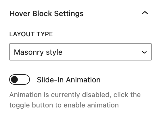
- Hover Block Settings
- This is where you configure the settings that affect the entire Image Hover block.
- To access these settings simply click on the bottom edge of the Image Hover block in the editor. Once the bottom edge is selected, the settings will appear in the right side of the screen in the sidebar panel.
- Layout Type
- You can select from two image grid layouts, Masonry style and Uniform grid.
- Masonry style
- With the masonry style layout type selected the grid of images have a more staggered presentation and images across a row do not have equal widths.
- Uniform grid
- With the uniform grid layout type selected the grid of images is laid out in a more symmetrical presentation and images across a row have equal widths.
- Masonry style
- You can select from two image grid layouts, Masonry style and Uniform grid.
- Slide-In Animation
- Toggle this switch to enable or disable slide-in animation for the images.

- Image Hover Style
- Three styling options are available that mainly targets how the content that is revealed on hover is styled.
- Light Background
- Blue Background
- Darkened Background
- Three styling options are available that mainly targets how the content that is revealed on hover is styled.
Individual Image Hover Settings:

- Individual Hover Block Settings
- This is where you configure the settings that affect an individual image.
- To access these settings simply click on one of the images within the Image Hover block in the editor. Once the image is selected, the settings will appear in the right side of the screen in the sidebar panel.
- Choose an Image
- New images can either be loaded from the media library or uploaded directly to the block. You can change or remove the image by clicking on of the buttons that appear once an image is set
- Content Type
- There are three content types available for each image hover item:
- Image Link
- With this setting, the whole image will be a clickable link that has a darkened hover effect
- Editable Content with Link
- This setting allows you to set content that is revealed on the hover state. It includes a heading, blurb, and link
- Menu
- With this option you can set a predefined menu (set up in the menus section of the dashboard) to be revealed on hover
- Image Link
- There are three content types available for each image hover item:
Individual Image Hover Toolbar NOTES:
- Up / Down Arrows
- The up and down arrows in the toolbar allow the currently selected image to traverse up or down in the order of image hover items.
- You will not be able to reorder the first two image hover items because these images are locked.
- Lock
- When the lock icon appears in the toolbar this means that the image hover item cannot be deleted or moved within the editor. Users will not be able to remove or change the status of the lock as this is the intended behavior of the block.